Third Quarter Market Outlook Slides
To take a deeper dive into the quarter that was and where we may go from here, here are the Q3 2024 market guide charts that stood out to me from J.P. Morgan Asset Management’s Guide to the Markets slide deck.
U.S. Stock Market Valuations
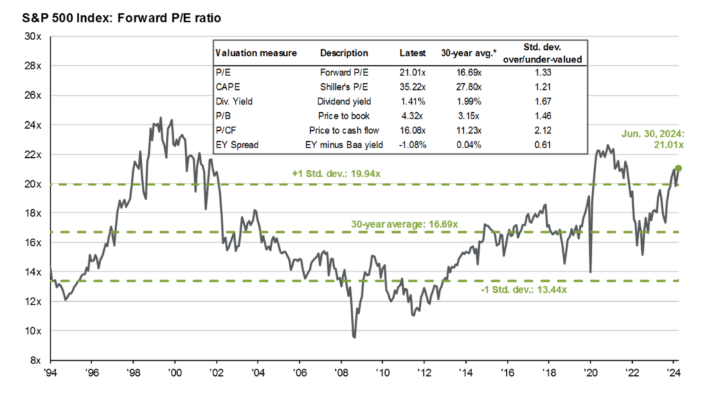
The various valuation metrics in this chart highlight the fact that by most measures the S&P 500 is overvalued compared to its 30-year average.
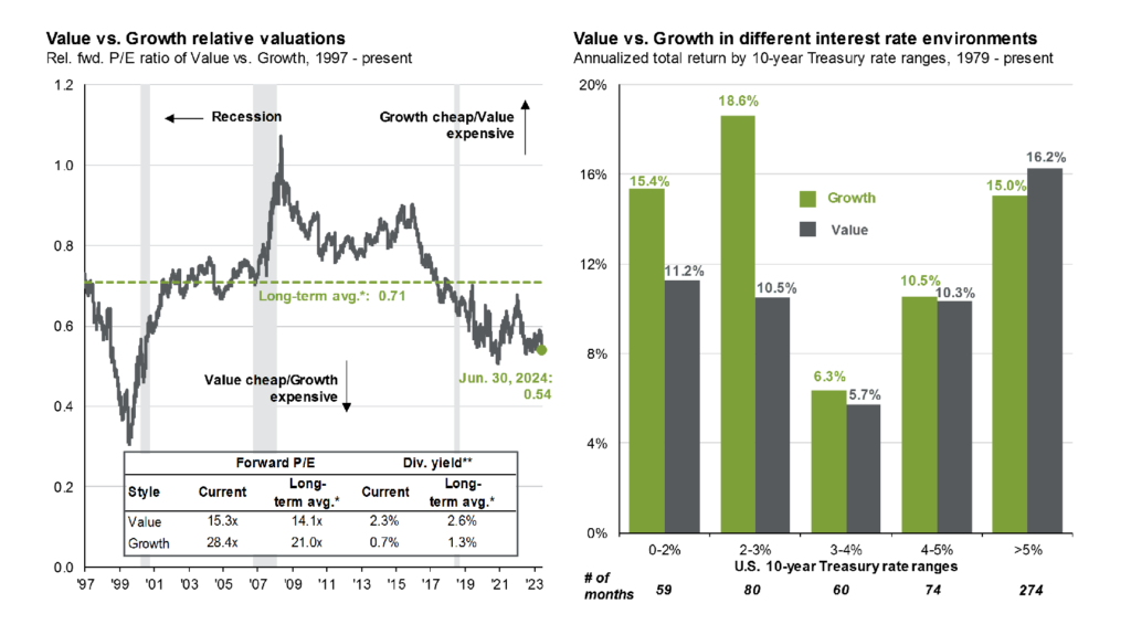
Looking at the valuation differences between U.S. growth and value stocks in the left chart shows that growth stocks are expensive compared to value stocks. The chart on the right shows that growth stocks have performed well in low interest rate environments, but that gap narrows with higher rates and that outperforms in higher interest rate environments.
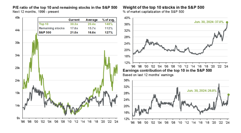
The S&P 500 has become increasingly concentrated in more expensive names. On the left, the valuation of the top 10 stocks in the index is quite a bit higher than the rest of the index and the index itself. The chart on the bottom right shows that their earnings haven’t kept pace with their stock performance, meaning most of the gain is due to multiple expansion not earnings growth.
Investor Education
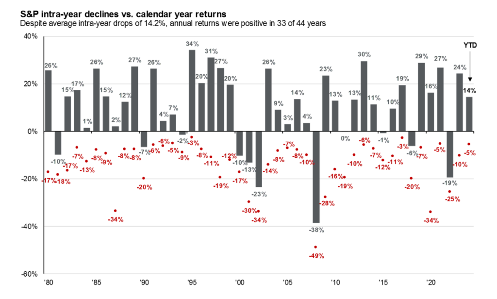
The market averages a 14.2% intra-year drop, so be prepared for market volatility and understand that annual double-digit drops are part of your investing journey.
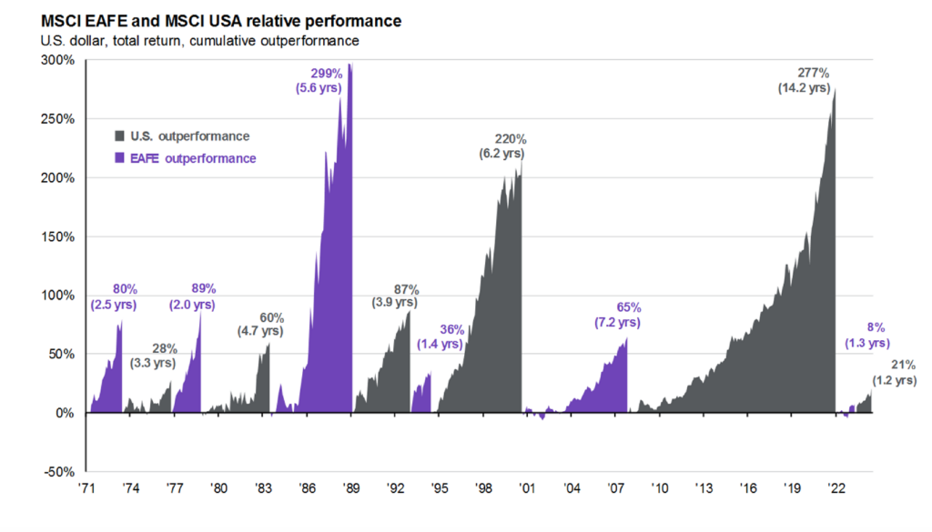
The U.S. and international markets have historically taken turns outperforming and right now (not pictured) international stocks are significantly cheaper than U.S. stocks..
Don’t let short-term volatility shake you out of earning the market’s long-term returns.

